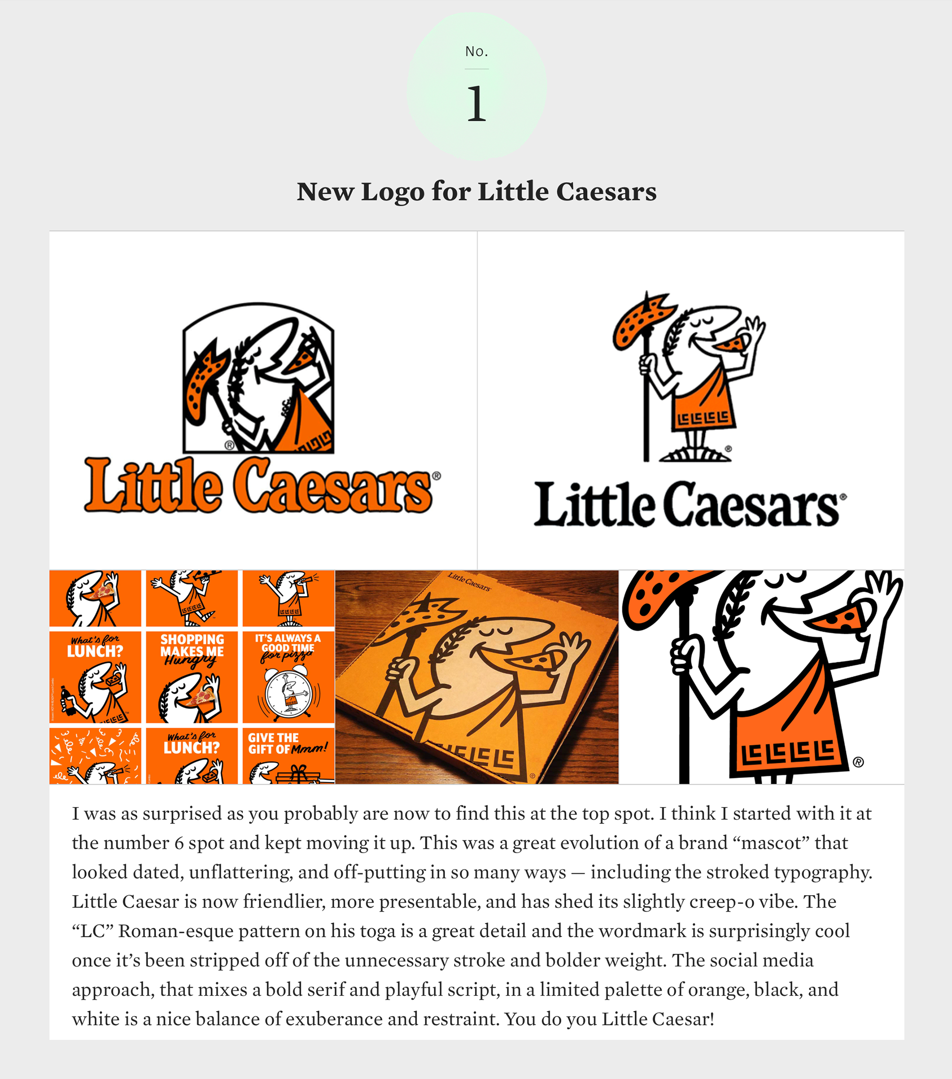
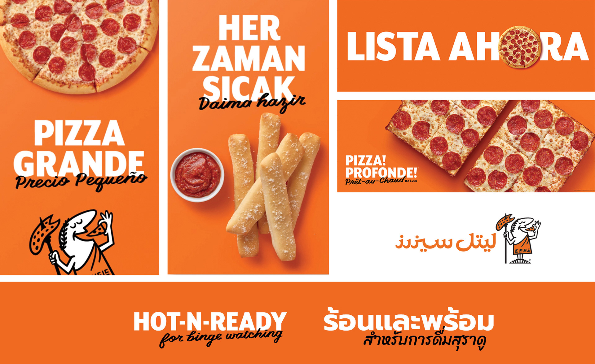
Little Caesars is the largest carryout-only pizza chain in the United States. Founded in 1959 as a single, family-owned restaurant, Little Caesars has become the third largest pizza chain in the world with stores in over 20 countries worldwide. This global growth happen quickly, and despite their best efforts, the brand became splintered as it moved across the globe. Each county had its own interpretation of the brand.
The objective was to create a clear, consistent global brand image across every consumer touchpoint that balances value, convenience, and great tasting products for pizza lovers of all generations.
The objective was to create a clear, consistent global brand image across every consumer touchpoint that balances value, convenience, and great tasting products for pizza lovers of all generations.
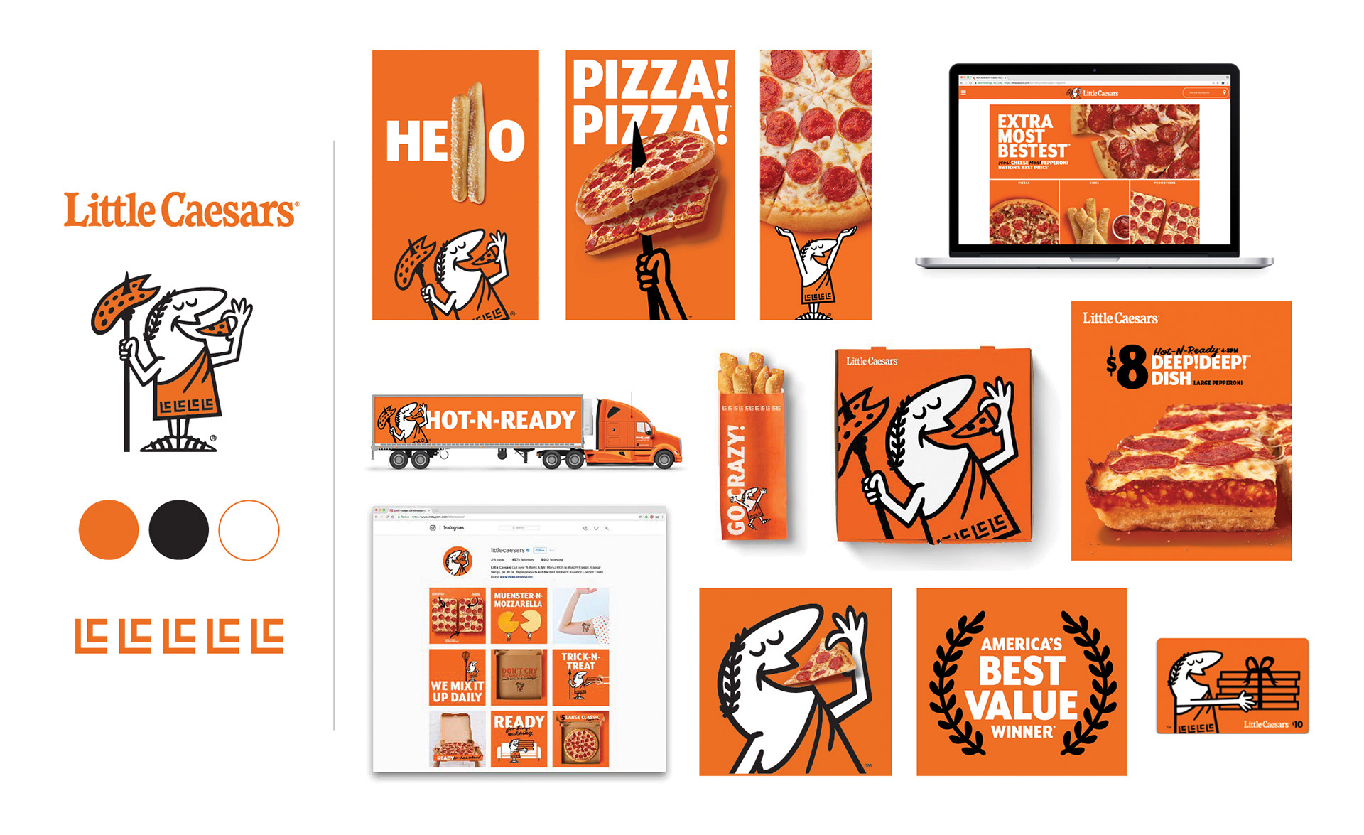
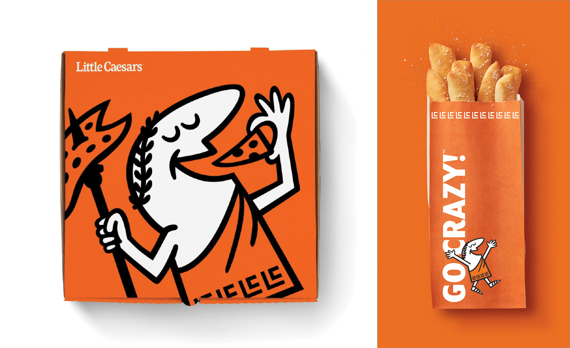
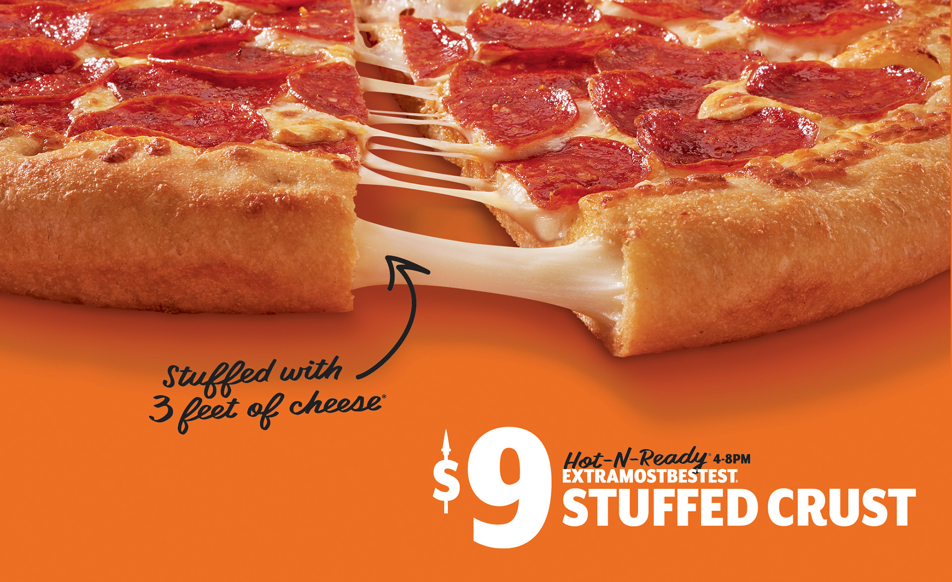
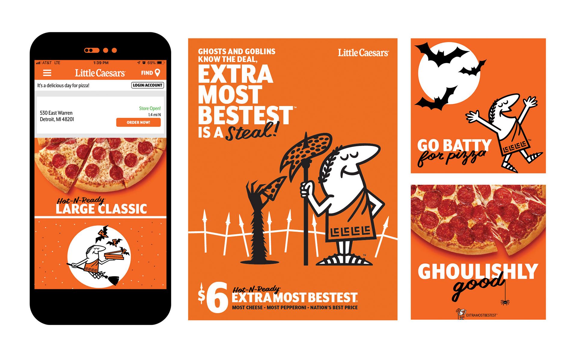
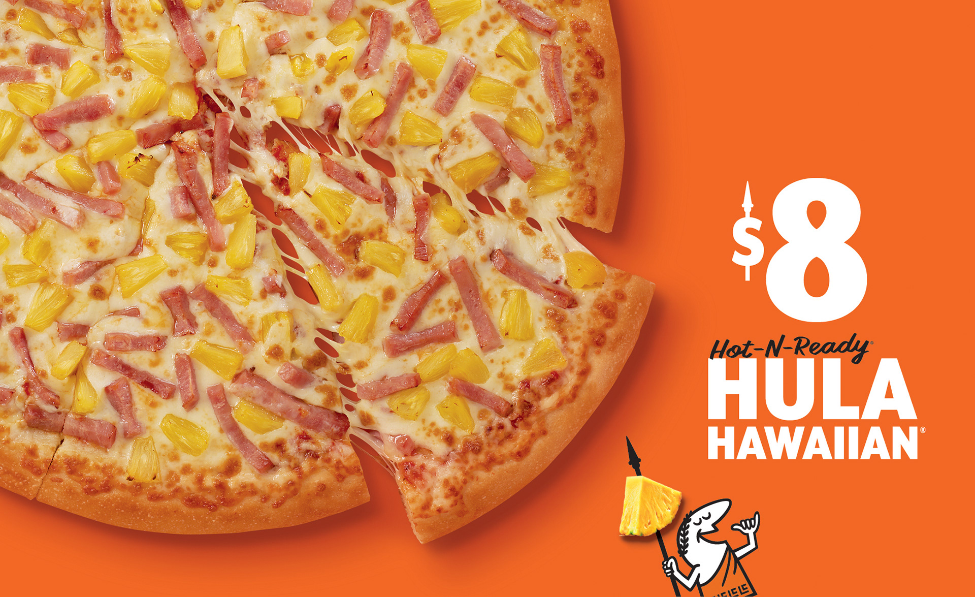
Little Caesar partnered with Turner Duckworth San Francisco to create one consistent global brand identity system. The transformation began by refreshing the brand’s assets—refining the Little Caesars wordmark for better legibility across contexts and redrawing the beloved classic Caesar character liberating him from his holding shape. The beloved character became more personable with an array of new poses, props, and animations. A custom typeface was also developed to reflect the handcrafted feel of Little Caesars products and added a touch of humanity to communications. The new approach to food photography dials up deliciousness and unmistakably by celebrating the brand’s distinctive orange color palette. The new packaging is iconic and acts as a key consumer touchpoint.

Under Consideration’s Brand New blog named Little Caesars brand identity the #1 refresh of 2018.